Hello. Many people said they found the analysis of the last simulation pass interesting, but many also said they didn't know how to interpret the charts. So this time I tried to change the interpretation a bit.
I drew a graph showing the distribution of prices after one year of simulation.
It's really hard to design a UI that explains things easily and is easy to understand at a glance ㅠㅠ
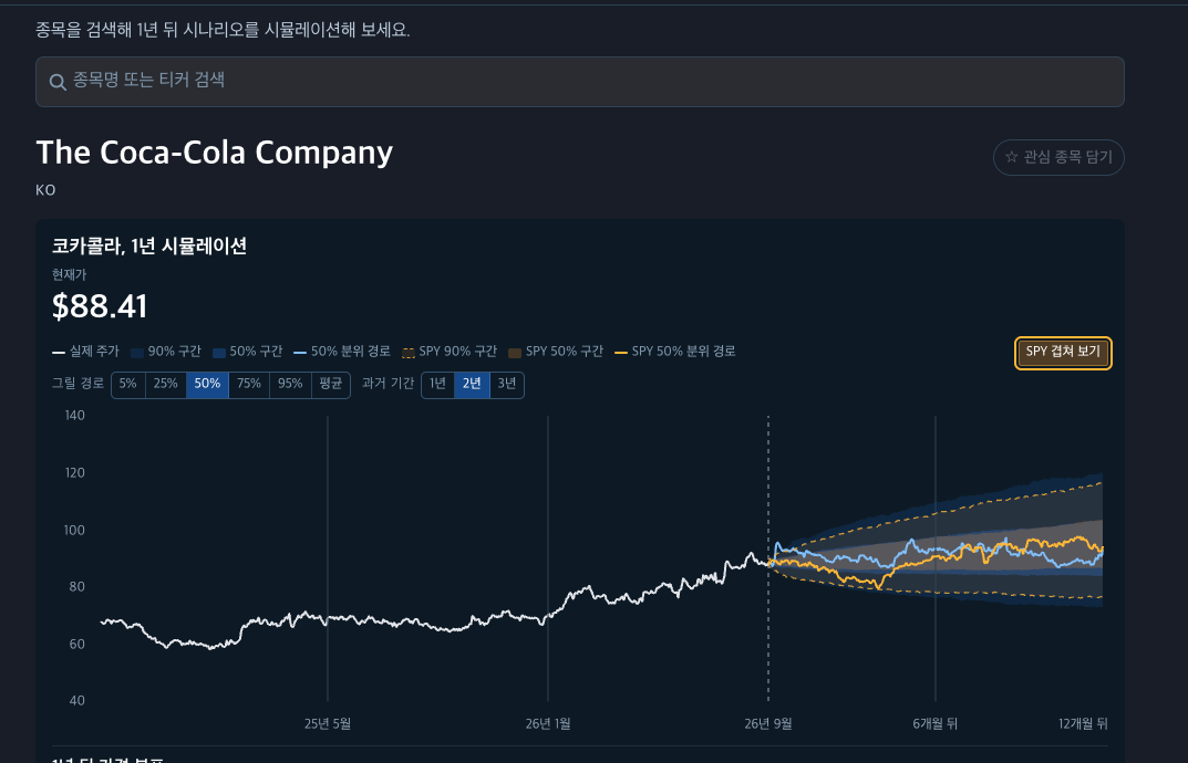
1. Let me explain using Coca-Cola as an example. First of all, I changed the UI so that you can directly set the simulation path you want (5%, 25%, 50%, 75%, 95%). You can also change the past period shown on the chart. As expected, Coca-Cola, a strong player in essential consumer goods/stable stocks, draws a simulation path similar to the S&P 500.
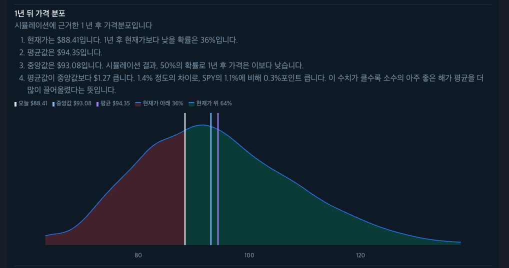
This part is a bit nerve-wracking, I don't know what you think. This is a distribution chart showing how Coca-Cola's prices are distributed after one year of simulation. The yellow line represents the current price. Therefore, the red area to the left of the yellow line represents the area where the price will be lower than the current price, and the green area represents the area where the price will be higher than the current price.
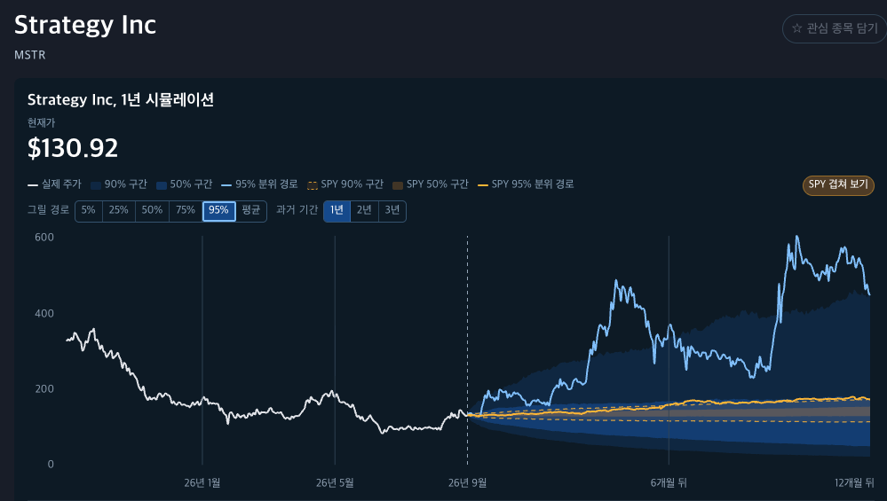
2. For comparison, let's look at a stock that is the opposite of Coca-Cola this time. It's a company strategy that moves like the leverage of Bitcoin prices. Looking at the 95% path (a scenario that only happens with about a 5% probability), it's not comparable to the S&P 500.
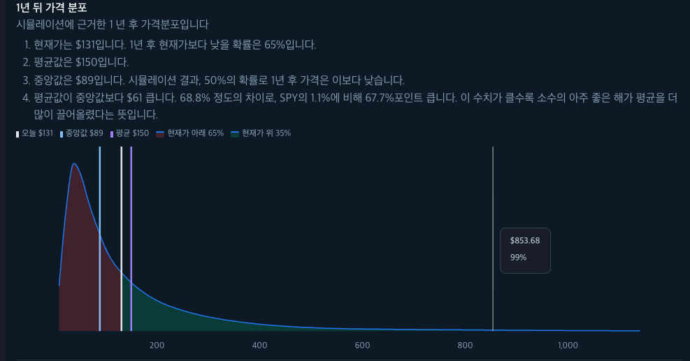
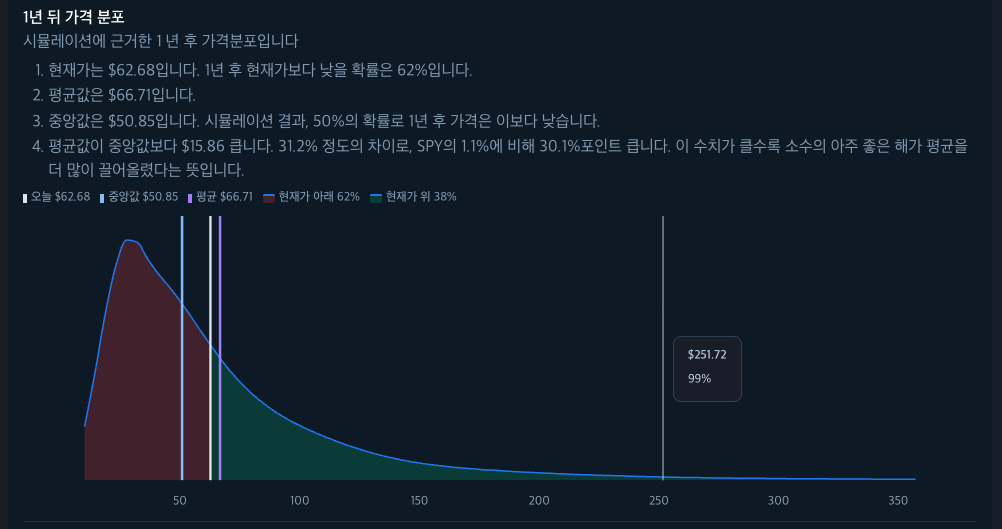
But the price distribution after one year is like this. The price distribution is heavily concentrated on the left, and the red area is much wider than the green area. This means there's a high probability that the price will be lower after one year than it is now. On the other hand, the right tail is very long. These are jackpot scenarios with a slim chance of existing.
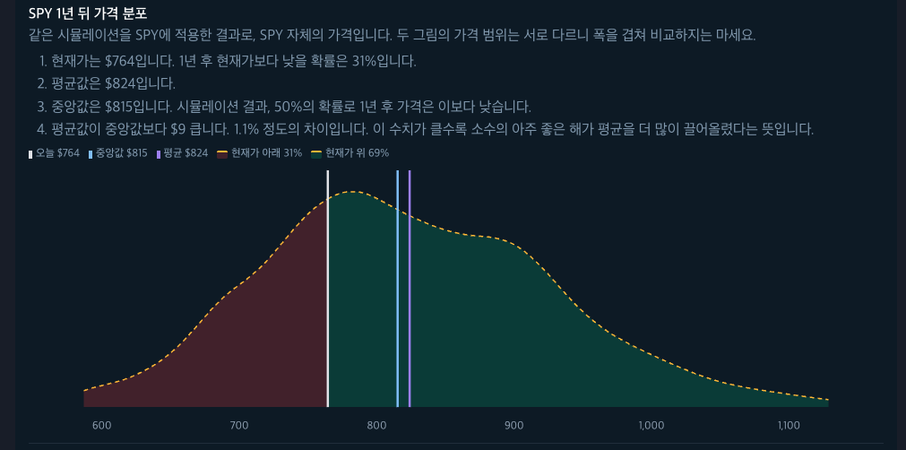
For reference, the following picture shows the price distribution of SPY ETF after one year. Compare it and you'll see a big difference.
3. Next is Ecopro.
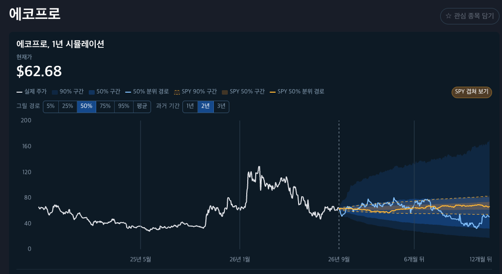
It also shows the characteristics of a high-risk, high-return stock. The simulation results show a 62% probability that the price will be lower than the current price.
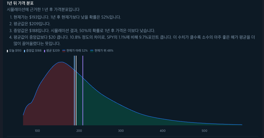
4. Samsung Electronics is much better because it's a large-cap stock. For someone like me, this graph seems worth investing in, taking on a little risk.
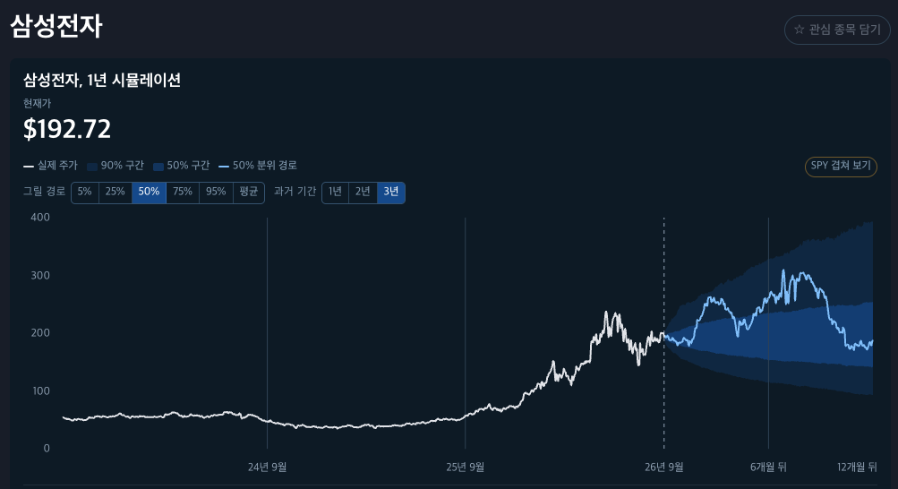
The probability of the price being lower than the current price is about 52%, but considering the scenario where it continues to rise, this graph suggests that a portion of assets could be invested. The probability of falling is still higher than SPY, but if you're taking risks, there's no way around it.
I tried to make the implications of the simulation results easier to see, but it's not easy... In the end, I revised the UI for a while... UI design is really hard.
Please feel free to use it and give me feedback if you have any ㅎ
Source: https://nextinvest.org/ko