The Verge article
Google's new gradient icon design is coming to more apps
https://www.theverge.com/tech/918852/googles-new-gradient-icon-design-is-coming-to-more-apps
This is a partial article translated by Gemini 3 Flash.
At the end of 2025, Google began launching new icons with gradient design applied.
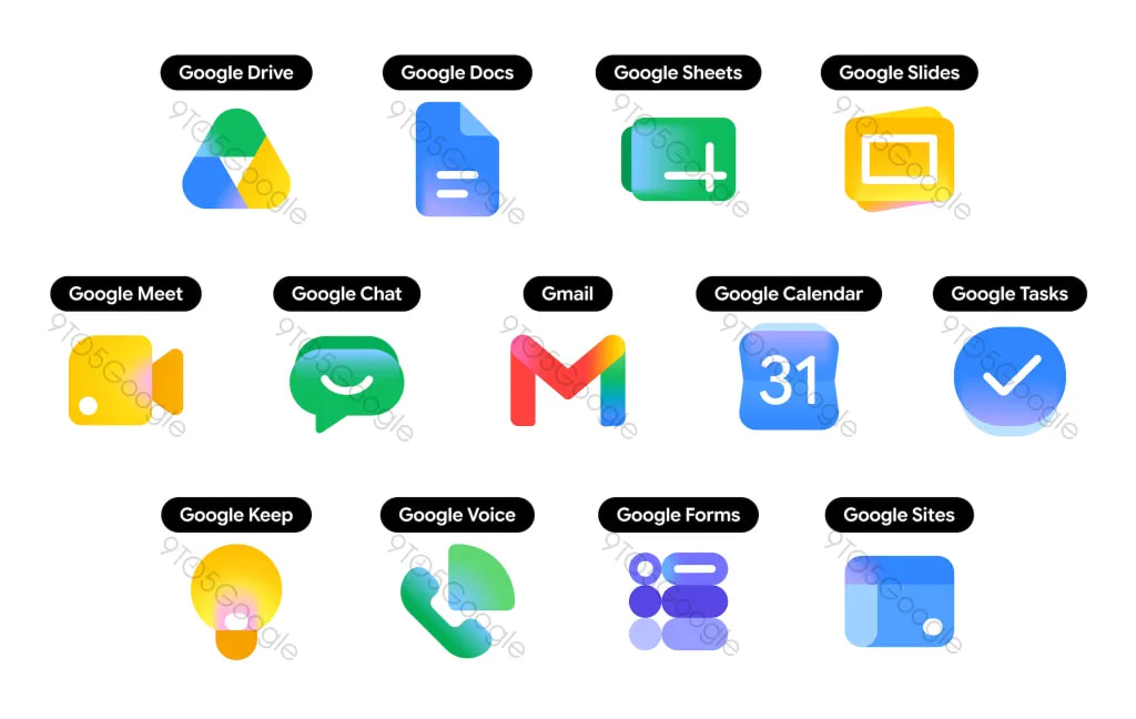
Now this new design appears to be applied to Google's other apps as well. 9to5Google has obtained new icon images that deviate from the existing consistent circular design that tried to forcibly include all colors of the Google logo.
Overall, the appearance has become much softer. The corners are more rounded, and the gradient naturally transitions from subtle pastel tones to Google's distinctive bright primary colors.
These new design languages can already be seen in Google's 'G' logo, as well as in updates to Gemini, Photos, and Maps. According to the 9to5Google article, it is said to symbolize the presence of AI-based features.
The new icons have become more cheerful, vibrant, and diverse, reflecting recent design trends that move away from the flat looks of the late 2010s and early 2020s. [Rest of content omitted]
Here is the 9to5Google article link.
Google's new gradient icons for Gmail, Calendar, Drive, and other apps are radical redesigns
https://9to5google.com/2026/04/26/gmail-google-gradient-redesign/